The readings and course materials for this week have prompted me to consider my earliest experiences with multimedia presentations. I specifically think back to a PowerPoint that I had to make introducing myself to my seventh class, and a few others that year about a historical figure in Social Studies, and my dream career in Health and Career Education. I remember testing out and trying to integrate every possible animation, font, and colour to create the most aesthetic graphics. However, oddly enough, I have no memory of actually learning about how to use the software PowerPoint nor of what elements to include in my presentations to make them engaging and positively received by an audience. So, I must have either forgotten being taught this, or in fact taught myself – my guess based on my current abilities and comfort level using PowerPoint and similar digital presentation tools is some combination of both.
After watching the How to Avoid Death by Powerpoint video, I can confidently admit that I have made just about every mistake that David Phillips touched on; I’ve crammed my slides to include numerous ideas, used as many images as possible to accompany them, and read directly off of them (Phillips, 2014). What’s interesting to me is that I have also sat through long, drawn out presentations identical to the ones that I have previously described, and know that they are in no way captivating. I recognize that one of the reasons that I keep going back to those methods is because I have a tendency to think that more information shows more work, but in the case of PowerPoint where less really is more, spreading out said information is the best approach (Phillips, 2014). Also, I feel that I had never really considered a PowerPoint itself as a resource to complement the presenter and not the other way around – I’m not extremely confident talking to large groups, and as a result always thought that I could make up for this or prevent any error by having comprehensive slides (Phillips, 2014). So, in addition to teaching individuals how to put together an attention grabbing multimedia presentation, I think that a class on public speaking to focus on appropriately pausing and varying tone of voice could be beneficial to build a well-rounded skillset (Principles of Multimedia Learning – Center for Teaching and Learning: Wiley Education Services, 2020).
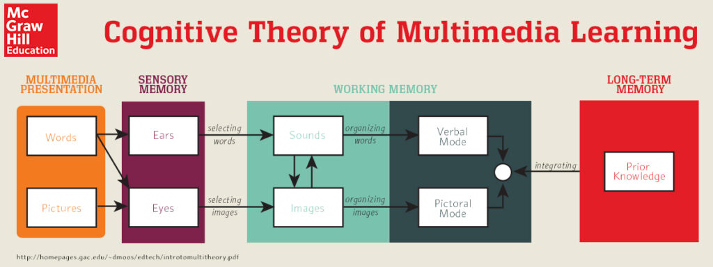
As well, I wanted to talk about some connections that I’ve made in regards to Cognitive Load Theory and overstimulation; i.e. why we should be cautious and steer clear of using content-heavy visual aid. The article Principles of Multimedia Learning emphasized what’s called extraneous load – wasted mental effort on details that don’t support an educational objective (Principles of Multimedia Learning – Center for Teaching and Learning: Wiley Education Services, 2020). Earlier this year I took a class about learning environments, ED-D 301, and one of our main points of discussion was how students need to be calm and alert in order to learn (Nicholson, 2021). So, when they are bombarded with bright posters, subtle background noises, and even wearing uncomfortable clothing in a classroom setting, the majority of their attention will go to processing those sensations, rather than to lesson itself – the same occurrence applies to a busy PowerPoint (Nicholson, 2021) (Phillips, 2014). The infographic that I’ve attached below helped me to wrap my head around just how complex of a journey it is to commit a piece of knowledge to the long term memory; again, its not a clear path, and our senses play a huge role in determining what makes the cut (McGraw Hill Canada, n.d.). Thus, I now understand that when crafting my presentation its critical to make the content as easy on the eyes and ears or as “sensory conscious” as possible, to ensure that those watching and listening are actually receiving the message that I intend them to.
Edit: I think my last sentence implied that multimedia presentations are somewhat behaviourist in nature; they very much having learning goals in mind that predetermine the outcome of the lesson (Ertmer & Newby, 2008). I am wondering how one could make a presentation that is more cognitivist or constructivist friendly, giving students more responsibility over their learning.
References.
Ertmer, P., & Newby, T. (2008). Behaviorism, Cognitivism, Constructivism: Comparing Critical Features From an Instructional Design Perspective. Performance Improvement Quarterly. 6, 50-72.
McGraw Hill Canada. (n.d). Cognitive Theory of Multimedia Learning [Infographic]. MHEducation. https://www.mheducation.ca/blog/richard-mayers-cognitive-theory-of-multimedia-learning
Nicholson, D. (2021). Presentation on Cognitive Development [PowerPoint]. Faculty of Education, University of
Victoria.
Phillips, David JP. (2014, April 14). How to avoid death by PowerPoint [Mp4]. TED Talks. https://www.youtube.com/watch?v=Iwpi1Lm6dFo
www.psycology.org
Principles of Multimedia Learning – Center for Teaching and Learning: Wiley Education Services. (2020, January 31). https://ctl.wiley.com/principles-of-multimedia-learning/


May 20, 2021 at 11:43 am
Great post! It took me a long time to acknowledge that, as you mentioned, more information does not always show you have done more work. Of late I find it just as taxing to get to the point clearly as to writing reams of pages.