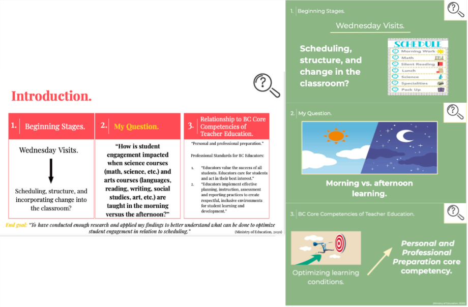
For this assignment, I chose to upgrade an old GoogleSlides presentation that I made for my EDCI 250 class last year, a seminar for a field experience in an elementary school classroom. The basic premise was to summarize findings for an inquiry project, and mine was related to optimizing student learning through scheduling. Although I feel that I was able to communicate my findings through my first go, and tried to adhere to what I know now as the Dual Coding theory by implementing words and images, I wish that I had had a greater understanding of the multimedia concepts touched on in this course (Cognitive Theory of Multimedia Learning, 2011). Specifically, it would have been helpful to know that, as stated in the Cognitive Load theory, that overwhelming the working memory results in audience members failing to remember content (Shaw, 2014).
Attached is a pdf of my first version, followed by the ways in which I have upgraded it in order to make it overall easier to engage with.
Overall Busyness and Reducing Extraneous Load.
One major thing that I noticed upon reviewing my presentation was the sheer amount of information that I had crammed onto each slide. After reading Mayer’s work, It became incredibly apparent that I needed to remove all unnecessary details to prevent my audience from wasting their energy on processing materials that weren’t relevant to my topic (2014). To accomplish the preceding, I took advice from the Death by Powerpoint video and broke my content down into additional subtopics (i.e. created more slides) (Phillips, 2014). Then, with only one idea on each slide, I further simplified them by sticking to the rule of “no more than 6 objects” present (coherence principle) (Mayer, 2014) (Phillips, 2014). I also made sure that I was referring to the same point of discussion through mixed media no more than twice (redundancy principle), and that when integrating any images that I kept them close to any corresponding text, as well showed these simultaneously (spatial contiguity and temporal contiguity principle) (Mayer, 2014) (Phillips, 2014).

Visual Appeal and Reducing Extraneous Load.
One thing I did not realize was that colours and fonts can also contribute to compromised processing if they are too loud. To combat this, I decided to dramatically transform my presentation; I omitted the harsh pink and yellow that I previously had and exchanged it with a soft green and yellow scheme, paired with the sans-serif font Monsterrat (Miller, 2019). Additionally, I tried to create more contrast by using a dark background and light text, and doubled checked that the most prominent feature was the most important (signaling and coherence principle) (Mayer, 2014) (Phillips, 2014). Lastly, I drew from a combination of bolding, highlighting, and underlying to draw attention to key words (signaling principle) (Mayer, 2014).

Images, Voice, Managing Intrinsic Load, and Optimizing Germane Load.
As we all know, motivation is a major factor when it comes to learning (Cognitive Theory of Multimedia Learning, 2011). So, something that I recognized that I could do to increase my audience’s motivation to learn was replacing large chunks of text with applicable images, which are significantly less overwhelming (modality and multimedia principle) (Mayer, 2014). Additionally, in order to make my presentation more relatable, I attempted to vary the tone of my voice in a conversational style, and added a few more practical examples/ancedotes to help with connection making (personalization and worked examples principle) (Mayer, 2014).

Misc.
With the Principles of Learning in mind, I edited, but kept a “summary slide” in my presentation to meet the principle Exercise, which says that repeating information allows for improved recall (Principles of Learning, n.d.). To create a stronger presentational framework, I also clearly expressed my goals in the beginning slides, and made sure to include statistics as evidence for my research (goal-oriented and empirical principles of the Instructional Design Model) (Kurt, 2015).


With the description complete, below is my final, upgraded version of the EDCI 250 presentation. For fun, I have included a short clip of it in action!
References.
Cognitive Theory of Multimedia Learning. (2011, July 13). In ETEC510: Design Wiki. http://etec.ctlt.ubc.ca/510wiki/Cognitive_Theory_of_Multimedia_Learning
Kurt, S. (2015, December 9). “Instructional Design Models and Theories,” in Educational Technology. https://educationaltechnology.net/instructional-design-models-and-theories/
Mayer, R., & Fiorella, L. (2014, August). Principles for Reducing Extraneous Processing in Multimedia Learning: Coherence, Signaling, Redundancy, Spatial Contiguity, and Temporal Contiguity Principles. In R. Mayer (Ed.), The Cambridge Handbook of Multimedia Learning (Cambridge Handbooks in Psychology, pp. 279-315). Cambridge: Cambridge University Press. doi:10.1017/CBO9781139547369.015
Miller, A. (2019, June 13). 6 dos and don’ts for next-level slides, from a TED presentation expert. TED. https://ideas.ted.com/6-dos-and-donts-for-next-level-slides-from-a-ted-presentation-expert/
Phillips, David. (2014, April 14). How to avoid death by PowerPoint [Video]. Youtube https://www.youtube.com/watch?v=Iwpi1Lm6dFo
www.psycology.org
Principles of learning. (n.d.). Psychology Wiki. Retrieved from https://psychology.wikia.org/wiki/Principles_of_learning#Intensity
Shaw, A. (2016, July 14). Principles of Multimedia Learning. Wiley Education Services. https://ctl.wiley.com/principles-of-multimedia-learning/
Leave a Reply
You must be logged in to post a comment.